You may have noticed I’ve been quite on this blog for a while. I’ve started a new position as an Assistant Professor in Journalism and Art + Design at Northeastern Unversity! I’ve launched the Data Culture Group there, where I’ll be working with others to builds collaborative projects that interrogate our datafied society with a focus on rethinking participation and power in data processes. I invite you to keep an eye on that new blog for updates on my workshops, projects, and writing on data literacy and culture.
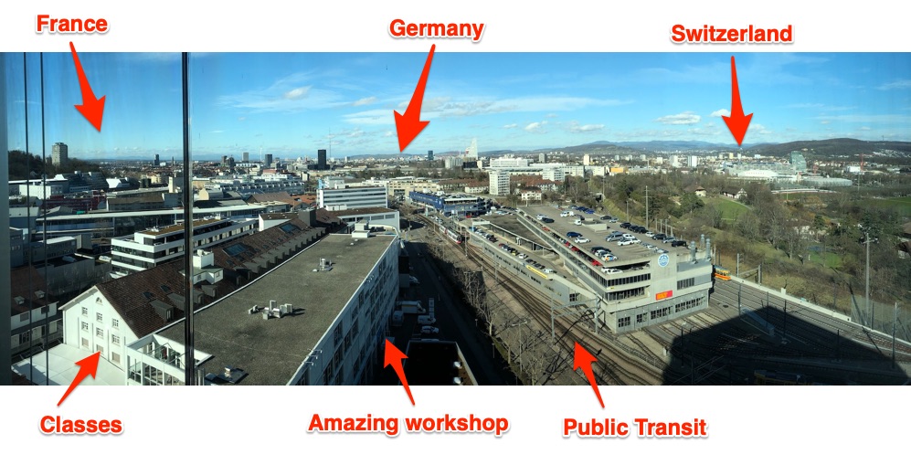
Teaching data storytelling is difficult. The norms, “canonical” readings, and the cutting edge evolve every month! With such an evolving landscape to work within, I relish the opportunities I have to explore something new and different with students in a focused way. This past week I had the great pleasure of doing precisely that at the invitation of the FHNW Institute of Industrial Design as part of their International Design Workshop. The week, which reminded me of MIT’s IAPsession, is an opportunity to bring in outside instructors to work with undergraduate industrial design students in the week that starts their spring semester. Fifteen students and I explored designing and building data sculptures based on exploring civic datasets. I’ve been writing about how I want to push the field of physical data storytelling, and I hope these contributions help. Here’s a run down of the project they made, and what I learned to inform my teaching practice.
My annotated postcard from the top of FNHW’s beautiful campus library.
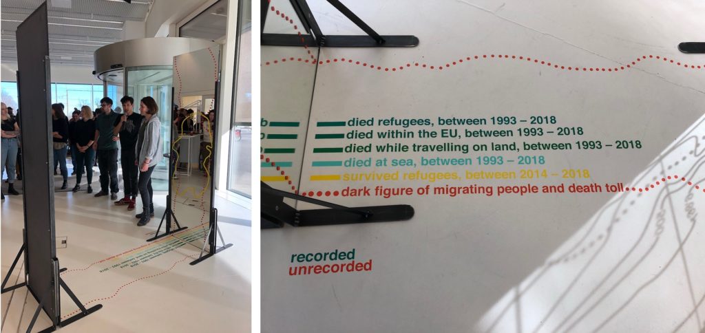
recorded unrecorded
By Fiona Beer, Leon Rauscher and Stephan Jäger
Refugee crises around the world are heart-wrenching and complex. Measuring and understanding the scale of the movement is difficult. In Europe ongoing flows across the Mediterranean Sea have been amplifying for the past decade. This group decided to take on the challenge of telling a story about this refugee crisis to their fellow students by making a large data sculpture that you walk through.
The piece centers around two mirrors facing each other, with lines and text decorating them, and invites the viewer to walk through. As they state:
This installation tries to show the number we know of, but simultaneously to represent the dark figure of deaths, names, age, origins, and causes of death, we have no idea of.
They acknowledge and embrace that reliable and complete data about migration, refugees, and deaths are impossible to come by.
Echoing the aesthetic of topographic map contour lines, they represent the “known” data on the floor and up the glass; one side for the living, the other for the dead. In addition, the dotted line suggests the data we don’t know, and have little way to estimate – the “dark figure of migrating people and death toll.”
This is all fairly readable from outside the sculpture, but stepping in between the mirrors creates an infinitely repeated landscape. The contour lines extend on forever, echoing the endless journey undertaken by so many migrants. The numbers and lines become hard to read, echoing the truly unknowable nature (a creative approach to the problem of visualizing uncertainty the field struggles with).
I think the core metaphor of the contour lines and the reflections that underlie this piece are resonant and memorable. More importantly, for me they pulled off a visual and physical design that embraces the humanity of the data, rather than treating them as abstract numbers that mask the crisis.
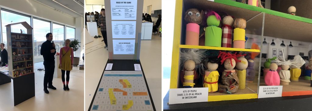
By Christina Bocken, David von Rotz and Silvan Häseli
Switzerland is a wealthy (and expensive) country, but there is large income inequality. This group was inspired by a piece from CBS This Morning to explore this inequality in Switzerland. They found, to their surprise, that just 2.5% of the Swiss population holds more than half all of the wealth. They decided to share this story, and what causes it, with a doll-house sculpture and a board game.
The multi-story dollhouse is divided into 3 sections about wealth ownership, each populated according to how much of the population holds that wealth. As the note on the yellow section states – “65% of people share 3.5% of all the wealth in Switzerland”.
To pull readers into why, they created a modified version of the popular snakes-and-ladders board game – called “Who Becomes a Millionaire”. Walk around back of the dollhouse and you’ll find a large playing board, dice, and instructions. Here’s the thing – the game is rigged. The rules change based on your gender, family background, education, and where you live! Playing as a woman nor born in Switzerland? Sorry, you don’t advance very quickly.
Inequality is hard to tell stories about, so I was excited to see this group take this challenge on. I think the house is a lovely invitation to come investigate the piece, and the board game is a creative pull to get the audience to dig in to the data more deeply. Building around the metaphors of the house, and the rules of the game being rigged, were key “anchors” to their design.
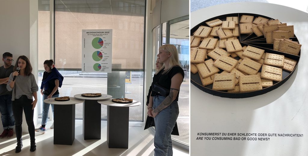
Intrigued by our Media Cloud database of news reporting, and the surge of reporting on coronavirus, this group decided to explore the Swiss news landscape in 2020. News sucks us in; we want to read it, feel responsible to read it, but often end up left feeling powerless and upset by it. They found the top 3 themes written about were all depressing things – fears around coronavirus, aftermath from the assassination of Suleiman in Iran , and the tragedy of the Australian fires. This team asked “How consciously do you consume media? How do you digest bad news?”
This piece is built around a visual and explanatory pun – the idea of “consuming media” like one does food. Mapping each topic onto a pie-chart style plate, they laser-cut words into biscuits based on their frequency of use when discussing each of those top three topics. This is a literal representation of the news we consume, and I can tell you that picking up a cookie etched with “coronavirus” certainly does give you pause!
I think this piece is a delightful provocation to think about the news we consume each day. The representation in food is an inviting way into a thoughtful topic, hopefully breaking down barriers the audience might have to reflecting about their own news consumption. The 3 plates are playful, pulling you over to understand why they are different sizes.
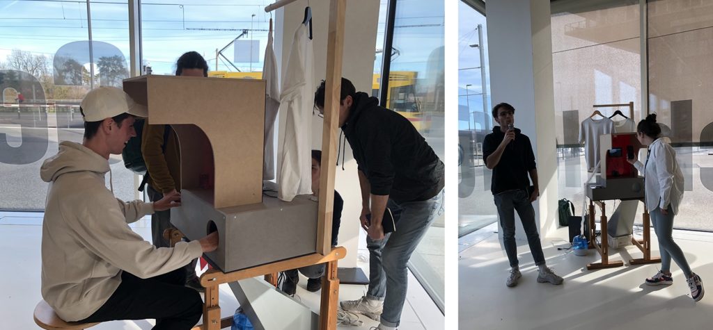
The true environmental cost of the goods we produce and purchase is almost impossible to comprehend – there are just too many variables. This group rose to this explanatory challenge, creating an immersive multi-sensory piece that assaults your senses when you choose an environmentally unfriendly option.
The piece present you with a choice between two identical-looking shirts, sit down and press the button associated with the one you want. Once your choice is made, three things happen that represent the environmental cost of the object:
The animation and sound of water on a screen increase based on the amount of water used to produce the shirt.
Smoke pours out at you (from a fog machine), obscuring your vision and making you pull back, based on the how many greenhouse gases are emitted in the production and transport of the shirt.
Your other hand, inserted (trustingly) into a dark box, is sprayed with water based on the amount of water used to produce the shirt. Well, it doesn’t actually spray your hand yet… they almost had it working by the opening so hopefully they’ll get it working in another day.
I’m delighted by their idea of creating a multi-channel assault on your senses. We don’t have good approaches to communicating the un-captured costs of these goods. This piece is a provocation to consider the physical impacts of those choices on your own body, rather than in some far-off rain forest or ocean.
Data Sources: TBD (I’m not sure what they used)
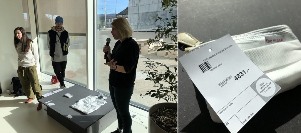
The Mask Collection
By Jasmin Schnellmann, Jasmin Vavrecka and Timo Lanz
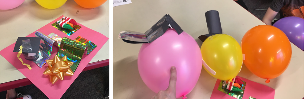
This group was struck by the public reaction and news reporting about coronavirus. While certainly it is cause for concern, they realized that global air pollution is a far more serious problem right now, in terms of deaths and scope. Trying to find a way to communicate this risk, they struck on the symbolic power of the medical face mask.
They created two objects for the mythical fashion show about “the mask collection”. The first is a small wallet made out of masks and sized based on the deaths due to Corona virus. The second is a large purse made of sewn together masks, sized by deaths due to air pollution. The viewer reading more closely is likely to be surprised by the “price tags” on each, with the small one having a higher one while the bigger one has a lower cost. These price tags show more detailed information about deaths and media coverage – which are inverses of each other. Air pollution has far more deaths but far less coverage (in 2020).
The objects they created speak very strongly to me. They make you look twice to understand how they are made, with strong red thread echoing a sense of importance and dread. It is a simple visual mapping, but presented as a collection of daily use objects they speak to the choices we make, and the risks we face, each day.
I was impressed by the students creativity, fortitude, and craftsmanship. They created these in just one week(!) with no previous experience with data storytelling. I continuously challenged them to think beyond simple tricks like physical bar charts and such, and I think they rose to the challenge.
From this one week I can picture expanding my approach into a semester-long course that explores the aesthetic principles of physical variables of data sculptures. Externalizing these models and stories creates an opportunity to communicate around and about them, and affords me the opportunity to revisit back on my training in the pedagogy of constructionism.
This builds on earlier thoughts I captured in a paper with Catherine D’Ignazio at the Pedagogy and Physicalization workshop at DIS 2017. It also has links to projects from many other academics working on these questions of data storytelling and 3d physical materials:
I look forward to exploring these techniques with students and building my own data sculpture practice more. I hope they inspire, resonate, and challenge you as well! If you happen to be in Basel this Feb or March, these are on display for a few weeks.
I’m seeing an increase of the number of people trying physical data visualizations, which I tend to call “data sculptures”, and I’m very excited about this! As more of our society is shaped by data-driven systems it is up to us to come up with more relatable and comprehensible representations of those data and processes. I believe data sculptures have a unique power in this response because of the way they engage people in space with data. They use the power of spectacle and novelty to catch attention, provide novel ways for people to relate to data they don’t know, and to bring regular people together to create things based on data.
What do data sculptures look like? The wonderful team at dataphys.org has been cataloging, thinking through, and writing about this for years. I could do no better background than they do in their paper about Opportunities and Challenges for Data Physicalization, so just start by reading that.
Ok, welcome back. So what is a data sculpture to me? It is a representation of data created using physical objects in the real world. While charts and graphs in 2D map data onto classical visual variables (size, color, shape, position, etc), data sculptures map data on to an additional set of things — smell, texture, 3D shape, taste, scale, etc. This media gives you a new toolbox with which to create data representations, and requires a new set of skills for creating with.
What I want to do is share some lessons and ideas from my ten years of helping people design and make data sculptures, in a variety of educational settings. Warning: I’m going to put on my Professor hat and share some of my strong opinions about what I think works and what I think doesn’t. I look forward to your constructive disagreements.
This posts teases out three themes I’ve seen with concrete examples from my teaching and beyond. These themes are:
Making charts in 3D just scratches the surface;
Choosing your materials wisely is critical to your physical data mappings;
Moving beyond gimmicks lets you flesh out how to support multiple levels of reading.
Making Charts in 3D
Most folks approach the idea of data sculptures with their existing vocabulary of data visualizations; they simply render an existing chart type in 3D using some physical material. This is all well and good, but I think making 3D charts misses the potential for data sculptures to attract and interact with audiences in memorable and provocative ways. Here are a few examples that went, or could have gone, a little further along that path.
‘The Humans of the Hackathon’ — created by Pratap, Richie & Sainath is a physical visualization of participation at the July hackathon conducted at Gramener, Inc.
Parallel coordinates are hard to read, but are powerful because they can show both trends and individual data points (see the great writeup on datavizcatalog.com for more details). Rendering them as a physical spectacle is a wonderful idea to both attract attention and do get to know the data. However, I’m left wondering about missed opportunities in the creation based on the physicality of the sculpture itself.
This project immediately brought to mind earlier work by the Domestic Data Streamers, who prompted attendees of a 2014 arts event to create a similar chart (they called it “Data Strings”). They key difference here is that they asked the participants themselves to create their data points. I think that addresses the main criticism I’d have of the Gramener example — it helped the authors understand and represent the data, while the Data Strings example took advantage of the idea to engage participants more fully.
If you’re going to make a chart in 3D, make sure it is in 3D for a reason. The Domestic Data Streamers participatory invitation is a strong reason.
Fireworks: Fun & Dangerous
Lets tackle another example of a very chart-like data sculpture. A team of students in my 2016 Data Storytelling Studio course decided to analyze fireworks-related injuries in the US. As they thought about how to best represent this in a quick data sculpture prototype, they landed on the idea of painting a mannequin to show where injuries occurred most.
Heatmap of injuries from fireworks between 2009 and 2014 in the US. Darker red represents parts ofthe body that had more injuries. Created by Judy Chang, Gary Burnett, and Andrew Mikofalvy.
This repurposing of a heat map in 3d form was a clever idea, especially since it used the human body itself in a very relatable way; you couldn’t help but feel the impact of the dark red hands (good color choice). It was a simple comparison story rendered in an emotionally evocative way, clearly intended to caution the audience about being reckless with fireworks! Yes, it is an old technique rendered in 3D, but the physical scale of the body standing in front of you fundamentally changed how you read it — you related to it.
It’s a Mysterbee
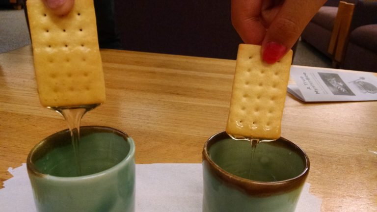
Let’s move on to the classic bar chart. A team of students from my 2018 class were digging into data about bee colony collapse across the US. Thinking of how to get people interested in a topic they might not otherwise be engaged with, the students decided to tell a high-level comparison story in honey itself by filling two cups with honey. Each represented a different year, and the amount of honey was based on the total production in each year. They invited the hypothetical audience to dip a cracker in each cup and compare — essentially creating drippy and delicious bar charts.
Edible comparison of honey produced in the US in 2016 vs. 2017. Note the cracker on the left is covered in much more honey than the one on the right, and is thus more delicious data to consume! Created by Olivia Brode-Roger, Mitchel L Myers, Alicia Ouyang. Learn more.
When was the last time you ate your bar chart? This invitation used a familiar method of reading that would make sense to people, but playfully used the subject of the data itself (the honey) to represent the data in a simple way. They had follow-up material that could support a longer conversation for folks that did stop and try the experiment, so it wasn’t just a one-trick show that ended with questions. The bar chart in 3D supported a comparison, and the cracker lent itself to being a barchart. Their use of the bar chart had a reasoning to it.
Closing Thoughts on Charts in 3D
I’ve been thinking about this theme for a while, because I see it so often. In fact in class, and in our Data Sculptures activity, I explicitly caution against doing this. I don’t mean to say it is never appropriate. In fact a 2013 study from Jansen dug into 3D bar charts to explore if they supported investigation and inquiry more. I took away the lesson that when people physically touched the 3d objects representing the data they did a better job understanding the data. A more recent paper they wrote, from 2016, investigated different approaches to mapping size as a physical variable and how people perceived it. It has a range of interesting findings, such as how spherical surface area was more accurately perceived than volume, but mostly point out that we don’t understand yet how physical variables are perceived.
Take Advantage of Your Material
The second theme I want to flesh out is how much the material matters. Cardboard is light and folds easily; balloons grow and shrink, float and pop; water flows, drips, quenches your thirst and gets you wet. If you’re using any of those materials, take advantage of how people use the material and what it can do. The creators of the Gramener graph acknowledge this for themselves, noting the power of how “feeling every data point was an experience in itself”. Choose your material intentionally to design the look, feel, smell, and taste of your data sculpture. Here are a few examples that flesh out what I mean.
Where is Your Water From
Water is used in a variety of ways across the globe — agriculture, industrial operations, human consumption. A group in my 2019 course used data about this breakdown to create an interactive piece about the future water available to us. They called it Where is Your Water From?. Their interaction was built around people’s perceptions of what water is used for and comparing that to the data.
Pieces of an interactive physical exploration of water use data. Created by Lily Xie, Sarah Caso, and Tanaya Srini.
They key point I want to emphasize with this example is how the invitations they crafted for participants centered around the “wateriness” of water. When asking people to guess how much water is used for different categories, they ask participants to pour the water from one container to another. When looking at data about how much water might be available in the future for us to consume directly, participants were invited to drink the tiny amounts. These two actions are strong examples of using the properties of water to help support the narrative they are trying to tell. They used the physical affordances and human behaviors around water to represent the data story.
Tasting Air Pollution
Taste is a wonderful sense to explore, and playful thing too map data to! Data Cuisine has been leading workshops doing this since around 2014 — their gallery has some wonderful examples of data rendered in food. Many are visual representations, but others alter flavor based on the data. A group of students in my 2017 course were inspired by this idea to sketch out an idea that mapped air quality data onto flavor in a project called Tasting Air Pollution.
Air quality is hard to experience; we don’t see subtle changes and don’t have a good sense of what an abstract air quality number means in terms of our daily experience. Stephanie Posavec and Mariam Quick’s “Air Transformed” piece gets at this in a concreate way. They literally created a set of glasses that obscured what you could see more based on how much pollution was in the air.
This group of students in my class decided to experiment with flavor as a way to represent air quality data. They were particularly curious about how we perceive intensity of flavor, and how gagging or couching on surprising or bad flavors feels like the response you have to polluted air.
Edible data brownies used to represent air quality in various cities. The salt level increased with air pollution levels (using a taste-based perceptual scale based on their in-kitchen experimentation). Created by Tina Quach, Margaret Tian, Tony Zeng, and Aina Martinez Zurita.
To surprise the audience they invite participants to taste different brownies but didn’t telling them that the amount of salt had been increased based on how much pollution in the air there is in different cities. The “goal” brownie has the right amount of salt to make it delicious, while the Beijing brownie tastes horrible. Trust me, I was the test subject when they presented it in class!
Closing Thoughts on Materials
Data sculptures are more than just ink and paper or pixels on a screen. Data sculptures are made of something, and you have to think about what that smoething should be. Be conscious and intentional in your choice of the material you make your data sculpture out of. Consider the affordances, limitations, common uses, and interaction patterns of your material. Choose your material wisely.
Support Deeper Investigation
In my workshops and classes I encourage participants to support many “layers of reading” in their pieces. What dose that mean? Viewers should be able to quickly scan the piece and understand the main story, but should also be able to dig deeper to see more nuance and detail associated with the narrative.
Here’s the thing — most data sculptures I see don’t have many layers of reading. They use some kind of clever gimmick or tongue in cheek pun to make their point. I want to encourage you to move beyond these simple tricks and flesh out a multi-layered story that can be told with multiple uses of your physical mappings. There is a richness in your material and form that you should take advantage of.
Monopoly and Elections
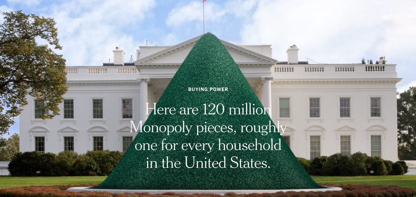
One of the few examples in print that I showcase often is an article published in the New York Times in 2016, entitled The Families Funding the 2016 Election. The narrative focuses on the small number of obscenely wealthy families that were responsible for most of the campaign donations. To tell this story they use the visual metaphor of houses and hotels from from the board game Monopoly; a symbol instantly recognizable to any American kid.
A pile of Monopoly houses, used to represent the number of households in the US. Screenshot of a New York Times article.
The article opens with a visual pun. They show a mocked up photo of a huge pile of green Monopoly houses blocking the White House, then quickly zoom in to a tiny pile of red Monopoly hotels on top (as the reader scrolls). The whole pile literally obscures the White House and the contrast between the number of red and green pieces instantly reveals the story arc (along with the text superimposed on top). This is playful, effective, and a good example of a data sculpture presented in 2D.
Keep scrolling down the piece the reader discovers why this is even more powerfully used. First off, they continue to represent data with these same physical symbols to compare things like party affiliation of the donors.
Continuing the visual pun — Monopoly hotels used to represent households in a comparison by party affiliation. Screenshot of a New York Times article.
Continuing event further down the piece one fnids that they bridge from house satellite imagery to maps showing their locations, and real photos of the houses themselves. This progression of representations is a wonderful example of really pulling all the power out of the physical symbol that you can. They support digging deeper and deeper into the data and the narrative, utilizing this physical representation in different ways throughout.
The Hidden Weight of Food
The water used in food production is becoming a larger topic of discussion as droughts become longer and more frequent. Another group of students in my 2019 course used the data about water cost of foods to create a series of sculptures — the hidden weight of food. They describe the interaction like this:
The hook is a long table with plates of food. Each plate has a fork with a bite-sized piece of food on it, such as a slice of apple. When you lift the fork, you realize it’s much heavier than a slice of apple should be. Upon being surprised and interested to learn more from the exhibit, you read the sign and realize that the weight you are lifting is the weight of the water used to produce that bite of food. For a slice of apple, that’s a full 27 pounds.
Data sculpture with hidden water underneath the table. Picking up each fork surprised you because it was connected to the heavy water load underneath. You can see the small black strings tying the fork to the water bucket beneath. Created by Sarah Von Ahn, Amy Vogel, and Theresa Machemer.
I can tell you from experience that it is a very surprising and effective trick, even in the rough prototype form that they build. They took advantage of the fact that we eat food, and that water is heavy. This comparison, between the expected weight of a bite of food vs. the far larger weight of the water used to produce that bite, is a super compelling and surprising story. It tries to capture that surprise and turn it into interest. They considered the subjects of the data (water and food), and used their affordances to design a delightful and evocative data sculpture.
They expanded on this simple and surprising interaction by adding another sculpture that provides more detail. After lifting the forks and becoming engaged with the topic, viewers can walk to the next sculpture, which breaks down the types of water used in the production of an orange, to complement the total volume of water presented in the first sculpture. They use the familiar shape of 2-liter bottles to make a pyramid with colored water representing different types of water. This constructs another physical invitation, digging into the story of water along a different dimension.
The second piece used the idea of colored water in 2-liter bottes to dig beyond total volume of water and into the type of water.
Closing Thoughts on Layers of
The lesson? Don’t stop with your initial idea; tease out how you can support your longer narrative using spark that you’ve got. Thee power in these examples is that they used the data sculptures approach to present multiple dimensions of the data story.
They expanded on this simple and surprising interaction by adding another sculpture that provides more detail. After lifting the forks and becoming engaged with the topic, viewers can walk to the next sculpture, which breaks down the types of water used in the production of an orange, to complement the total volume of water presented in the first sculpture. They use the familiar shape of 2-liter bottles to make a pyramid with colored water representing different types of water. This constructs another physical invitation, digging into the story of water along a different dimension.
They power here is that they used the data sculptures approach to present multiple dominions of the data story.
This blog post is based on a keynote I gave recently at the 2019 SSIR Data on Purpose event.
Are you optimistic or pessimistic about data as a tool for good in the world? Over the last few years I’ve seen the shift in answers to this questions. People used to answer “optimistic”, but now most people indicate some mix of emotions. You’ve probably seen the Gartner hype cycle with its suggestion that a technology receives inflated expectations and then is overused to the point of disillusionment. I’d argue that the over-hyping and the disappointment happen at the same time… that time is now for social good organizations that are trying to use data to further their missions.
The response I’ve been crafting focuses on acknowledging the damaging history of the data practices we routinely employ, taking a step back from hype-driven roll-out of data programs, and working to align your data and your mission. The Data Culture Project, my collaboration with Catherine D’Ignazio, works with organizations large and small across the world to help make that happen.
One of the core problems in creating a data culture that aligns with your mission is the history we are fighting against. Data has been a tool for those in power to consolidate that power for centuries. For organizations working in the social good sector, this shouldfeel problematic! If you’re deploying some tool or process, you need to be wary of any pieces that reinforce that history. They can cultivate the opposite of the empowerment, engagement, and ownership goals that are probably at the heart of your mission.
Warning: In this post I’m going to depress you by reviewing some of that history. Don’t worry, I’ll close with some inspirations so it isn’t all doom and gloom. Make sure not to stop reading in the middle, otherwise you might walk away feeling pretty bad about the world!
A Depressing History of Data
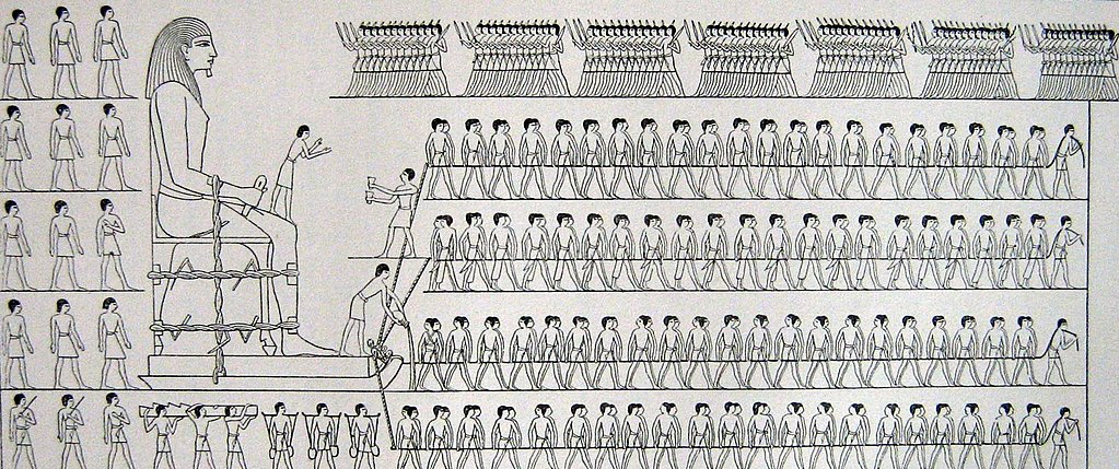
I won’t surprise anyone by talking about human history as full of stories of those in power seeking to oppress others. However, I want to highlight a few of those instances that were data-driven. Going back as far as the ancient Egyptians, we can find evidence that they tabulated and tracked populations to determine how much labor they would use to construct their giant monuments to themselves (read more at the UK Office for National Statistics). They created census data to drive massive construction projects in their own likeness.
Source – A Popular Account of the Ancient Egyptians, Sir John Gardner Wilkinson (1854)
Fast forward to Britain in the 1700s and you find the horrors of the slave trade via cross-atlantic shipping; all cataloged in stunning details by the shopping industry and the strict regulations they were under. Many of these massive data records are still available today. This economic data numerically catalogues the human suffering of tens of millions at the hands of those in power across the western world.
Next consider another of the darkest times in recent history – the Nazi regime. Their massive atrocities were informed and guided by the tabulations of their census, driven by IBM’s custom manufactured counting machines (read more on Wikipedia). This is a history IBM would like us to forget with their new Watson AI initiatives, but Watson was in fact the one that oversaw all this work as CEO at the time.
A few decades later we find another example in South America, recipient of massive investment and development packages from large multi-national UN-style agencies. All this drove numbers that showed enormous economic growth, while in fact huge populations were suffering. As famed author Eduardo Galeano writes – “the more watched and desperate the people, the more the statistics smiled and laughed”.
As for our current times? You can barely throw a stone without hitting another story of a large centralized technology company using some data in morally questionable ways. Amazon pitching facial recognition to ICE here in the US to keep migrants and asylum seekers out (The Verge), Facebook building massive datasets about non-users to improve their invasive advertising targeting (Reuters), China creating a “social credit score” to control and guide citizen norms (Bloomberg) – the dystopia is here. We are all quantized without any meaningful consent in the massive databases of the big tech corporations.
I know, that was pretty depressing. Usually I don’t pull in forced labor, slavery, and the Nazi holocaust into one blog post. Sorry. This thing is, this is the past and present that your data process is living within. We can’t ignore it. You have to work hard to make sure you’re not part of it. To fight this history, first we have to understand the patterns that drove it.
All of these examples showcase a problematic pattern of data use that we can characterize in four ways:
Opaque processes– the subjects of the data aren’t given any insight into what happens to the data about them
Extractive collection– the data is pulled from the subjects and their community by those outside of it
High technological complexity– the mechanisms used to analyze the data, digital and non-digital, have a steep learning curve
Control of impact– the people the data is about have no say in the impacts of the decisions being made with the data
From my point of view, these are process problems(read more in my paper on with Catherine D’Ignazio). Ok, in some of the more egregious examples above these wouldn’t be described as “problems”, because clearly their goals were to actively oppress and kill the subjects of the data. However, that isn’t the goal of most data endeavors!
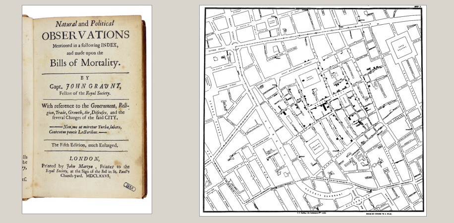
The thing is, even many well-meaning, pro-social data efforts use this problematic process. Consider the history of public health and epidemiology to start. In 1663 you have John Graunt carrying out the first recoded experiments in statical data analysis; the ancestor of epidemiology (learn more on Wikipedia). By recoding information about mortality, he theorized that he could design an early warning system for the bubonic plague ravaging Europe. Definitely working for the social good, but in a position of power with no engagement with the effected populations. Extractive dart collection, a complicated statistical process, and no control of impact for the population in mind.
Or how about the famed maps of John Snow, used to discover the origins of cholera in the early 1800s (learn more on Wikipedia). A noble, impactful, and meaningful example of data usage for sure – literally saving lives. The same process criticisms hold – a person of privilege mapping data about “the poor” to discover something without any role of the people that were the data themselves.
When we quickly read these two stories, they sound like amazing historical examples of using data for good! However, when you examine them more deeply, you find the same four criticisms weighed above. Their data methods didn’t match their mission.
Some Inspirations
Knowing this history, how do you make sure you’re not doomed to repeat it? So how do you avoid these pitfalls? You build a data culture within your organization that can do better. You empower staff up and down your org chart to identify problems data can help solve and them support them solving the those problems. You open up your process, you bring people together, you help them make decisions with data. You don’t need data scientists to to this, you need a data culture. This is what our Data Culture Project is all about. Here are some examples to help explain what I mean.
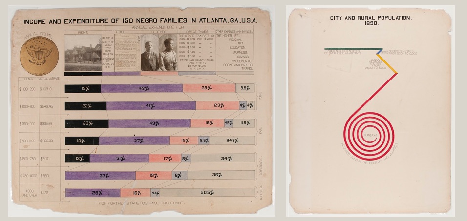
Two images from the “The Exhibit of American Negroes” exhibit created by W.E.B. Du Bois (source)
A wonderful historical example is the recently re-discovered works of W.E.B. Du Bois. He pulled census data, among other sources, to create a catalog of “the African American” in 1900. He brought the inventive and novel infographics to the world’s fair in Paris to showcase the work that needed to happen to create true freedom in the US post-slavery (work that is still being done today). He worked with African American students at the university to repurpose this census data to tell their story. These graphics are an example of self-determination – highlighting the problems the subjects of the data themselves have chosen. His statistical techniques were detailed, but he invented new ways to communicate them to a larger, less data-literate audience.
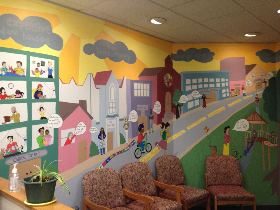
A data mural created by the Created by the Collaborate for Healthy Weight Coalition (August 2013)
A general theme in my work is using the arts as an invitation to bring people together around data to tell their own story. My work on data murals, a collaboration with my wife Emily Bhargava, is a prime example of this. We bring a group of people together around some data about them, help them find a story they want to tell, and then collaboratively design a mural to tell it. This puts the ownership of the data analysis and the data story in their hands, flipping the standard process on its head. The subjects of the data are empowering to tell the data story, with invitations to analyze the data that build their capacity and meet them where they are in skills and interests.
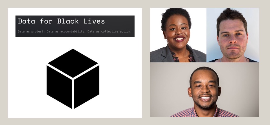
Data 4 Black Lives founders Yeshimabeit Milner, Lucas Mason-Brown, and Max Clermont
A more community-focused example comes from the Data 4 Black Lives organization(D4BL). The brutal legacy of slavery in the US permeates our culture, so it should be no surprise that it continues to poison the datasets we use as well. D4BL is working to highlight these problems, bring together organizers, data scientists, and students, and also influence policy to put data in service of the needs of black lives in the US. This is a traditionally marginalized community empowering themselves with the language of those in power (data) and trying to build community in service of their own goals.
1st place winner Danford Marco and his Khanga design
For a non-US example, we can look to the work done by the Tanzania Bhora Initiative and Faru Arts and Sports Development Organizatio as part of the Data Zetu Intiaitive in Tanzania. They ran a competition for designers to create khanga cloth patterns based on data (the khanga is a traditional cotton clothoften adorned with sayings or shout-outs). The project built the capacity of designers to speak data, and ended with a fashion show showcasing the winning designs (read more in their blog post). The first place winner (Danford Marco) created a design to reflect that 1 out of every 2 married women have faced some kind of abuse from their husband. A staggering statistic, and a stunning design to bring attention to the problem. This kind of creative approach to building data capacity is an example of a very different process, one that is inclusive, builds capacity, and gives ownership of the data to the people it is about.
Match your Mission and Methods
Align your data methods and your mission
I’m hoping by now that I’ve convinced you that you need to think harder about the data methods you use in order to avoid re-creating the terrible historical practice associated with data. I’m focused on organizations that work for the social good, but this argument holds true for anyone using data. The inspirational examples I highlight all paint a path forward that lets us match our mission and our methods. Which path will you follow?
We live in a world increasingly governed by algorithms. Sadly these algorithms aren’t creating a more neutral world of equitable outcomes; they are baking in historical injustices long present in society at large (1). Not surprisingly, those who are currently denied power in society are the most at-risk in this data driven future. Their voices should be amplified and set the agenda. The Data for Black Lives(twitter) organization works to bring together one communty of folks working on this — data scientists, organizers, and more.
Over the weekend I was honored to be invited to create an experience for their second conference. After chatting through some ideas with them to understand their goals, we decided to focus on encouraging attendees to share their commitments and their demands for a more just data present (and future). I designed and created the Just Data Cube to do this in a fun way that would also make the otherwise-boring common space a little more interesting!
Attendees add commitments to themselves on the inside of the cube.
The 7-foot cube invited people to write their commitments to themselves on its inside walls. What actions did they want to take to create data-driven justice? Of course, it isn’t just up to us. Organizations, companies, and governemnts are crafting the data-driven survelliance society we live in. So on the outside they were invited to write their demands of those actors. What must the data-powerful do to create a more equitable approach to data.
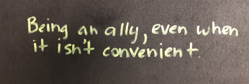
One attendee’s commitment.
My hope was to create a space for people at the event to share how they approach to working on justice in their work with data. Similarly, in the spirit of founder Yeshimabeit Milner’s open letter to Facebook, I wanted folks to share their demands of those in power that have all the data.
The Just Data Cube was more than simply a wall for graffitti. These commitments and demands inspired other participants that read them as the wall filled up. This qualitative dataset (once we type it up) will feed into other programs and processes D4BL has underway!
For me, the Cube is another attempt to find arts-based invitations to engage with complicated and impactful issues. From my point of view it was a success! People engaged with both the object and the process it invited:
they sought it out to sit under;
they socialized within it;
they contributed their thoughts to it;
they read the commitments and demands from other people.
The Cube livened up the otherwise dry conference space with a unique invitation to break the rules — it encouraged you write on the walls! I talked with a lot of the people writing up comments, and got the overall impression that they were both delighted (to have a fun thing to do) and also challenged (the have the prompt be one that forced them to think).
Thanks to the D4BL organizers for giving me a chance to participate, and if you were there I hope you found the cube both fun and inspiring!
A few years ago I went to the first UN World Data Forum and made some amazing connections with non-profits large and small (read more about that here). A common theme at that event was how to help organizations and governments get the data they needed to start work on the Sustainable Development Goals.
I just returned from the 2018 event, and found a new message repeated over and over – how can we help those who have data communicate about its potential and its impact? I’ll write more about that later. For now I want to share a bit about the session I ran with my collaborator Maryna Taran from the World Food Program (WFP). It was a pleasure to return to the event where we first met and speak to the impact we’ve had at WFP, and how the Data Culture Project has grown to a suite of 7 hands-on activities you can use for free right now.
Empowering Those That Don’t “Speak” Data
Our session was designed to focus on bringing the non-data literate into the data-centered conversation. The idea is that we can help these folks learn to “speak” data with playful activities that try to meet them where they are, rather than with technical trainings that focus on specific tools.
We introduced our arts-centric approach to creating participatory invitations through the data cycle – from data collection, to story-finding, to story-telling. Specifically, we ran our Paper Spreadsheets activity and our Data Sculptures activity. Maryna also shared how the WFP has rolled out a data program globally, where the Data Culture Proect activities fit into it, and some of the impacts they’ve seen already.
Participants filling in a paper spreadsheet.
The Paper Spreadsheet activity led to a wonderful discussion of data types, survey question create, and security concerns. The Data Sculptures folks created were a great mix of different types of stories, so I highlighted some of the scaffolding we’ve created for finding stories in data.
One of the most rewarding comments at the end was from a woman who worked on the data analysis side creating charts and such for her team. She noted that she often will share a chart with others on the team and they’ll say “tell me the story”, much to her frustration – she just didn’t understand what they meant. What more did they want than the chart showing them the evidence of the claim or pattern? She was pleased to share that after this session, she finally had a way to think about the difference between the charts she was making and the story that her colleagues might be looking for! Such a wonderful comment that resonated with a lot of the points Maryna was making about how and why WFP is rolling out the Data Culture Project activities in parallel with their more technical data trainings.
When people think about working with data, they usually think about the technologies that help us capture, manipulate, and make arguments with data. Over the last decade we’ve seen radical growth and innovation in the toolchains available to do this, leading to a huge increase in the number of people that have started working with data in some capacity. For data literacy learners, it is tempting to let the tool dictate the outcomes. Need to make a chart? Let the tool recommend one. The problem is that these tools don’t help you with the process of working with data. The tools won’t write your data story for you — you have to run that process yourself. Here are a couple of examples that help illuminate this gap that I see, and how my work with Catherine D’Ignazio on the Data Culture Project helps address it.
Excel doesn’t help you ask the right questions
When you’re first starting to work with a dataset on some problem, it is critical to frame a good set of questions aligned with your goals. Do you have a hypothesis that you are trying to test? Is there a specific audience you are trying to engage with the data? What assumptions do you bring to the data? Tools like Excel help you dive in to a dataset with low friction, but can’t help you identify the right questions to ask. Sometimes you need to take a step back and think about what you’re trying to achieve.
We created our “Ask Good Questions” activity to introduce this idea. You use our WTFcsv tool to browse quick visual summaries of columns in your dataset, and then brainstorm questions that could be interesting to ask it, other datasets that might help you answer those questions, and how you’d get those datasets. You don’t try to answer the questions at this initial phase, you just capture them all as potential roads to follow.
A photo a from workshop in Boston, MA, USA where we tested some of these activites.
Diving into one dataset can be like putting on blinders; it limits your ability to see the possibilities outside of that single dataset. You have to take a step back to consider questions that might require you to pull in and use other datasets. Tools can’t do this for you; it is up to you to make the effort to distance yourself from where you start in order to make sure you stay on target for you goals with the data.
Tableau won’t write you a strong narrative arc
Humans think and understand the world through stories. Background context, strong characters, a clear flow from start to end — these are the key elements of story that help engage us all. Telling stories and making arguments with data is no different. Tools like Tableau can be very powerful for helping us debug the visual representation of our data stories, but they don’t scaffold the process of coming up with the narrative arc. Which characters appeal to the audience we have in mind? What resolution of our data story will drive action towards the goals we want?
Our “Data Storybook” activity helps you prototype your data story’s narrative arc. Once you’ve got a story to tell, follow our instructions to fold a big piece of paper into a small storybook. Then use comic-book or children’s-book style illustrations to tell your story over three page flips. Your book has to say “once upon a time” on the front cover, and say “the end” on the back cover. There is something magical about the page turn… it forces you to think about the beginning, middle and end of your story. This is how you work on a strong narrative arc.
Participants at a workshop in Belo Horizonte, Brazil, writing a data storybook.
When you’re telling a data story, you have to make sure the flow is supported at each point by the data you include. Any data you include must reinforce and connect to the main narrative arc, no matter how detailed it is, otherwise you’re going to lead your intended audience astray and lose them in a confusing non-central plot-line. The tools can’t do this process for you.
R can’t help you pick the right way to tell your story
Once you’ve got a strong narrative with your data, how do you decide what format to tell it in? This decisions has to be driven by strong definitions of your audience and goals. Tools like R can’t make those connections for you; you have to consider the constraints yourself. Will readers have the visual literacy and geographic awareness that it takes to read a map visualization? Are they pre-disposed to agree or disagree with you? Are you presenting in a formal setting to an engaged audience, or on the street at a festival? These kinds of questions are critical for making an informed decision about what medium to tell your data story in.
We built our “Remix an Infographic” and “ConvinceMe” activities to help you work on this skill. The first invites you to look at the argument an infographic is making and then try to “remix it” — telling the same story as a data sculpture, creative map, personal story, or data game. Understanding the affordances of each media is critical for picking an appropriate one for your audience and goal. The second activity, ConvinceMe, helps you practice brainstorming data arguments that can drive different audiences to action. You identify stakeholders that can effect change on the system your dataset represents, invite volunteers to role play them, and then collectively try to drive them to action with creative data-informed arguments.
Workshop participants in Boston, MA, USA planning out their remix on a whiteboard.
Any dataset contains a multitude of potential stories, all of which can be told in a variety of ways. The digital tools that exist don’t help you navigate that space to pick the best story, nor tell it in the more appropriate way.
Working with Data Relies on Strong Processes and Strong Tools
People think about technology as soon as you mention data. I hope these example help illustrate why I think it is so important to separate the issues of the processes and technological tools for working with data. The innovative tools can only help you so much.
Organizations around the world are using these activities I mentioned to work on the process pieces, often in parallel with their work introducing technological platforms. Non-profits, newsrooms, libraries — these are some of our many partners on the Data Culture Project.
Do you want to try these activities out in your organization or classroom? Visit http://datacultureproject.org now to see our free suites of tools for working with people in creative, arts-based ways at every point of the process of going from data to story.
Each spring I have the pleasure of teaching MIT undergrads and grad students in my Data Storytelling Studio course. It is a hands-on, projects focused course built around creating quick prototypes of data-driven stories that try to get an audience to do something. This year the course focused on climate change as the theme, as part of the Boston Civic Media intiative. I provide relatively clean datasets they can use, sourced from online portals and local community groups. Over the course of the semester they work on building charts, creative charts, maps, creative maps, data sculptures, and interactive data experiences. Checkout the newly published full course content on MIT’s OpenCourseware site. Here is a quick run-down of their final projects.
Building Back Somerville’s Urban Forests
Students in this group combined a few datasets to create a public event that motivated people to ask the city to plant more trees. They created the shadow of a “missing” tree on the ground and filled it with facts about the impacts and dangers to trees in the city. Visitors were invited to fill out paper leaves with their favorite tree stories and hang them on a tree the community built together. Their conversations with visitors illuminated how the public thinks about the tree canopy of the city, and how and why people were motivated to advocate for more. Read more about the project in their write-up.
Save the Bees
This group used data about bees populations to create a playground game for 2nd and 3rd grade students. The game helps them learn about why bees are important to us, and how to protect them. The kids enjoyed the game thoroughly, and made great suggestions for how to improve it. The quotes from the kids illustrated their drive to understand more fully how bees help our planet, and what they could do to help. Learn more about the game in their write-up.
Adventures of a Frequent Flyer
This group created a game visitors to a farmers market could play to explore data about how bees are moved around the US to pollinate crops in various states. Their goal was to engage the visitors in advocating for better laws to protect bees that move through their states. Participants were invited to pick their favorite fruit, and then follow the bees as they travelled to the state that produced it most. Read their whole write-up here.
It’s a Mysterbee
This group focused on the MIT population of students, appealing to they sense of curiosity to motivate them to work on projects that might help bee colonies thrive. This interactive data sculpture invited participants to dip crackers in honey to find out about the volume of bee colony production in two different years. We don’t fully understand how bee colonies thrive and/or fail, which turned out bothers MIT students desire to understand everything! The projects across campus that were shared sparked folks who participated in the activity to get involved in the research. Read more in their write-up.
All our data literacy and data culture work is grounded in real workshops with community groups, non-profits, governments and businesses. However, I am an academic working at a university, so I also publish papers and go to conferences and such. For any others in that vein, below is information about a Data Literacy workshop I’m planning with Catherine D’Ignazio and Firaz Peer at the Participatory Design Conference this August. This is part of larger our efforts to build a larger group of peers working on these topics, and translate our collective learnings for use with a non-academic audience!
Big Data analysis and data-driven decision-making are buzzwords that are quickly becoming aspirational goals within industry and government settings. This so called data revolution has resulted in what some have called a data divide, where those with privileged access and knowledge about such data are given a seat at the bargaining table, while the voices of those who lack such skills, continue to be ignored. The data literacy workshop we are proposing is designed to work with the data newcomers within our communities, to give them a chance to use publically available data as a resource to advocate for change. Grounded within the Participatory Design goals of equalizing power relations through democratic practices, the workshop activities allow data newcomers to engage constructively with issues that they care about. Our goal in proposing these sets of activities as a workshop is to generate discussions around data literacy, engagement, empowerment, access, power and privilege that are typically associated with data and cities, and build connections between the PDC audience and the data literacy practitioners so they can take this research forward in innovative ways
Our goal in proposing this interactive data literacy workshop to the PDC audience is to offer it as a method that they can use to engage with those who are new to data and analysis. We hope to create connections between the PD discipline and practitioners within the data literacy space to learn from each other and inform this emerging field, to try to move the needle away from boring spreadsheet trainings conducted in dry online settings. We are interested in learning how our attendees define the term ‘data literacy’ within their own research and practice, and the tools, methods and techniques they use to operationalize it. In addition to demonstration of our methods, our workshop schedule also sets aside time for discussions and brainstorming of additional activities/techniques within this pedagogical realm. We would like to get a sense of what empowerment through data means to our participants and the communities they collaborate with. How can designers negotiate power and privilege differentials in relation to access and skills of working with data?
To participate
We invite researchers, practitioners, activists, educators and designers who are interested in furthering the state of data literacy within their communities to submit short position papers (upto 1500 words). We invite researchers, practitioners, activists, educators and designers who are interested in furthering the state of data literacy within their communities to submit short position papers (up to 1500 words). We are open to a range of paper topics. For example, your paper might discuss how you conceive of data literacy or your research methods of choice. Your paper might discuss examples of data literacy and raise questions over what constitutes ethical engagement and empowerment. Your paper might outline uncharted territory in relation to identity, power and data literacy – including challenging the concept and emerging norms of data literacy. Or, finally, the paper might talk about interesting approaches to data literacy and how they might be made part of the workshop activities.
Papers should be in the ACM format as suggested by the PDC organizers and should be submitted to the organizers before May 10, 2018. Final decision on acceptance will be communicated to the applicants by May 25th, 2018.
Please email your position papers to firazpeer@gatech.edu. We expect to select a minimum of 10 and a maximum of 20 participants to take part in this workshop. Accepted participants will need to register for the workshop through the conference website.
I’ve been connecting with more and more educators that want to take a creative approach to building data literacy with their students. Schools traditionally introduce data with in-class surveys and charting. This approach to generating their own data can be a wonderful way to empower learners to collect and represent data themselves. A more recent movement has centered around the STEAM movement – including the Arts along with the Science, Technology, Engineering, and Math curricular focus. I’m seeing a pattern at the intersection of these two approaches – educators are seeing strong engagement and results when they introduce their students to working with data through arts-based activities. Here’s a case study from a collaboration with the MIT Museum to flesh out how this can work.
Environmental Data Mosaics at the MIT Museum
This case-study was contributed by Brian Mernoff, one of my collaborators at the MIT Museum.
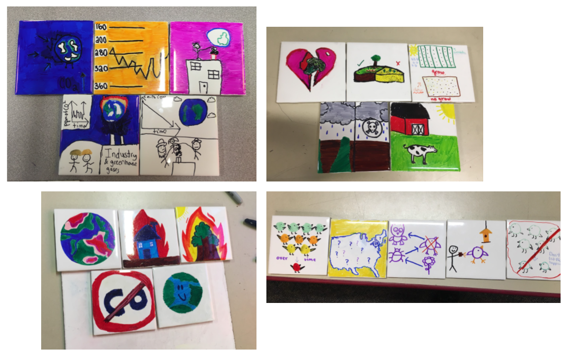
Each February, during Massachusetts school break, the MIT Museum runs a week of hands-on activities and workshops called Feb Fest. This year, the event was themed around our temporary exhibit, Big Bang Data, which explored how the increasing use of data affects technology, culture, and society. The purpose of the workshop was to let students view data sets of interest, understand these data sets, and share what they have learned with others in a creative and accessible way; all pieces of building their data literacy.
Data Sculptures as a Quick Introduction
As soon as students entered the classroom, they were asked to create a data sculpture based upon one of the sets of data placed at on their table. This is an activity the MIT Museum Idea Hub has already been running regularly. These data sheets contained relatively straightforward data sets to analyze, such as happiness in Somerville, and the cost of college over time. Art supplies were on the table, and the students worked with each other to create these sculptures while getting to know one another. After about half an hour each team presented how they decided to represent their data to the class. This activity was a great way to get them to get used to talking about data with each other and representing it in a novel way.
Data sculptures created by participants
Building a Collaborative Data Mosaic
After presenting the data sculptures, we began the main activity for the day. Students were given a list of websites (see below) that they could visit containing environmental data in either graphical or numeric form (see the Environmental Data Search worksheet). Once they had explored the websites, they discussed these websites with a second group of two at their table and determined which one of the links was most interesting to them to explore for the remainder of the project. Once the website was chosen, they again worked in their original group of two to find a story in one of the data sets on the website using the “Finding a Data Story” worksheet. After doing so, the two smaller groups recombined and chose which of the two stories they would like to tell in the final project.
In their story, students needed to explain the problem the data connects to, what the data is and shows, why the data is important, what the audience of the story should do about it, and what would happen in the long run if the reader did what was suggested (see the Data Story Mosaic Layout worksheet).
Some of the tiles participants made for the data mosaic
Learning Outcomes
Beyond these physical artifacts, the students’ discussions about data were particularly impressive. One group brought up a very interesting question about rare bird sightings and proceeded to debate it for about 15 minutes. They noticed that certain areas of the United States had more overall sightings of rare birds. At the same time, they looked at another data set on the same website showing the number of reporting bird observers across the country. Combining these graphs, they noticed that more rare birds are spotted where there are more reporters. This brought up the question of whether or not rare birds are actually as rare as shown by the data if there is such a close relationship between the two data sets. Both sides of the debate made good arguments and they eventually settled on the idea that the data was still valid, but incomplete. They would need more experiments in order to say anything conclusively. This demonstrates that the learners were in the “data headspace”, thinking about standard questions of representation, outliers, and normalization.
A second group, studying data on arable land, was trying to combine their data set with information on organic farming. This brought up good questions about what the terms “organic” and “GMO” actually meant, as well as whether or not it is related to the ability to reuse land over time. To their surprise, the students did some more research and realized that genetically modified foods and some types of “non-organic” farming actually increase what land can be farmed. Again, the activity pulled the learners into a space where they were curious and driven to understand the real-world approaches and impacts the data might be representing; making sure they understood what they had in front of them before finding a story to tell with it.
Overall, these projects allowed students not just to analyze data to find trends, but to think about why data is important and it can be used to find solutions to problems. Through their mosaics, students explored and discussed different potential solutions to determine which one they wanted to communicate with a larger audience.
The Opportunity of STEAM
Brian’s workshop is a wonderful example of how a creative arts-based approach to working with data can engage and proboke students in novel ways. It matches results we’ve seen in previous work on creating data murals with youth in Brazil, and working with a network of school on data challenges. These workshops are starting to help us build an evidence base for using the arts as an introduction to working with data. This can meet a larger set of students where they are. The physical artifacts and conversations around them are assets we use for evaluation and assessment. Are you an educator? We’d enjoy hearing how you are approaching this.


You must be logged in to post a comment.